

X Follow Card
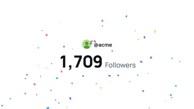
Animated X profile follow card — spring bounce-in, staggered blur-in, a synthetic cursor that clicks Follow and flips it to Following. Light/dark, horizontal or vertical.
Source
components/kuchi/x-follow-card.tsx
1"use client";23import { loadFont } from "@remotion/google-fonts/Inter";4import { useState } from "react";5import {6 AbsoluteFill,7 Img,8 interpolate,9 spring,10 useCurrentFrame,11 useVideoConfig,12} from "remotion";13import { Cursor, type CursorStyle } from "@/components/kuchi/cursor";14import {15 type CursorWaypoint,16 useCursorPath,17} from "@/components/kuchi/use-cursor-path";1819const { fontFamily: FONT_FAMILY } = loadFont();2021export interface XFollowCardProps {22 name?: string;23 handle?: string;24 bio?: string;25 avatarUrl?: string;26 coverUrl?: string;27 location?: string;28 website?: string;29 joined?: string;30 verified?: boolean;31 accentColor?: string;32 orientation?: "horizontal" | "vertical";33 speed?: number;34}3536interface Theme {37 page: string;38 cardBg: string;39 cardBorder: string;40 fg: string;41 fgMuted: string;42 divider: string;43}4445export const THEMES: Record<"light" | "dark", Theme> = {46 light: {47 page: "#f5f7f9",48 cardBg: "#ffffff",49 cardBorder: "#e6e9eb",50 fg: "#0f1419",51 fgMuted: "#536471",52 divider: "#eff3f4",53 },54 dark: {55 page: "#0a0a0a",56 cardBg: "#16181c",57 cardBorder: "#2f3336",58 fg: "#e7e9ea",59 fgMuted: "#71767b",60 divider: "#2f3336",61 },62};6364export const CLICK_FRAME = 110;6566const BUTTON_LAYOUT: Record<67 "horizontal" | "vertical",68 { x: number; y: number; w: number; h: number }69> = {70 horizontal: { x: 800, y: 240, w: 116, h: 40 },71 vertical: { x: 542, y: 336, w: 124, h: 44 },72};7374export function cardBounceIn(75 frame: number,76 fps: number,77): { translateY: number; scale: number } {78 const s = spring({79 fps,80 frame,81 config: { damping: 12, stiffness: 120, mass: 0.8 },82 });83 const translateY = interpolate(s, [0, 1], [60, 0]);84 const scale = interpolate(s, [0, 1], [0.9, 1]);85 return { translateY, scale };86}8788export function blurInSchedule(): {89 group: number;90 start: number;91 end: number;92}[] {93 return [94 { group: 0, start: 20, end: 26 },95 { group: 1, start: 22, end: 28 },96 { group: 2, start: 24, end: 30 },97 { group: 3, start: 26, end: 32 },98 { group: 4, start: 28, end: 34 },99 { group: 5, start: 30, end: 36 },100 { group: 6, start: 32, end: 38 },101 { group: 7, start: 34, end: 40 },102 { group: 8, start: 36, end: 42 },103 ];104}105106export function blurInAt(107 step: { start: number; end: number },108 frame: number,109): { blur: number; opacity: number; translateY: number } {110 const range: [number, number] = [step.start, step.end];111 const opts = {112 extrapolateLeft: "clamp" as const,113 extrapolateRight: "clamp" as const,114 };115 return {116 blur: interpolate(frame, range, [8, 0], opts),117 opacity: interpolate(frame, range, [0, 1], opts),118 translateY: interpolate(frame, range, [8, 0], opts),119 };120}121122export function followStateAt(frame: number, speed: number): boolean {123 return frame * speed >= CLICK_FRAME;124}125126export function buildFollowWaypoints(args: {127 buttonCenter: { x: number; y: number };128 orientation: "horizontal" | "vertical";129}): CursorWaypoint[] {130 const { buttonCenter, orientation } = args;131 const rest =132 orientation === "vertical" ? { x: 640, y: 1120 } : { x: 1120, y: 600 };133 return [134 { at: 0, x: rest.x, y: rest.y },135 { at: 75, x: rest.x, y: rest.y },136 {137 at: CLICK_FRAME,138 x: buttonCenter.x,139 y: buttonCenter.y,140 duration: 32,141 click: true,142 easing: "inOut",143 },144 { at: CLICK_FRAME + 30, x: buttonCenter.x, y: buttonCenter.y },145 ];146}147148function tintGradient(accent: string): string {149 return `linear-gradient(135deg, ${accent} 0%, ${accent}99 55%, ${accent}55 100%)`;150}151152function Cover({153 coverUrl,154 accent,155 height,156}: {157 coverUrl: string;158 accent: string;159 height: number;160}) {161 const [errored, setErrored] = useState(false);162 const fallback = (163 <div164 style={{165 width: "100%",166 height,167 background: tintGradient(accent),168 }}169 />170 );171 if (errored || !coverUrl) return fallback;172 return (173 <Img174 src={coverUrl}175 onError={() => setErrored(true)}176 style={{ width: "100%", height, objectFit: "cover", display: "block" }}177 />178 );179}180181function Avatar({182 avatarUrl,183 name,184 size,185 accent,186 theme,187}: {188 avatarUrl: string;189 name: string;190 size: number;191 accent: string;192 theme: Theme;193}) {194 const [errored, setErrored] = useState(false);195 const ringStyle = {196 width: size,197 height: size,198 borderRadius: "100%",199 border: `4px solid ${theme.cardBg}`,200 flexShrink: 0,201 boxSizing: "border-box" as const,202 };203204 if (errored || !avatarUrl) {205 return (206 <div207 style={{208 ...ringStyle,209 background: `${accent}33`,210 display: "flex",211 alignItems: "center",212 justifyContent: "center",213 color: accent,214 fontSize: size * 0.4,215 fontWeight: 700,216 fontFamily: FONT_FAMILY,217 }}218 >219 {name.charAt(0).toUpperCase()}220 </div>221 );222 }223224 return (225 <Img226 src={avatarUrl}227 onError={() => setErrored(true)}228 style={{ ...ringStyle, objectFit: "cover" }}229 />230 );231}232233function VerifiedBadge({ accent, size }: { accent: string; size: number }) {234 return (235 <svg236 xmlns="http://www.w3.org/2000/svg"237 viewBox="0 0 22 22"238 width={size}239 height={size}240 fill={accent}241 >242 <title>Verified</title>243 <path d="M20.396 11c-.018-.646-.215-1.275-.57-1.816-.354-.54-.852-.972-1.438-1.246.223-.607.27-1.264.14-1.897-.131-.634-.437-1.218-.882-1.687-.47-.445-1.053-.75-1.687-.882-.633-.13-1.29-.083-1.897.14-.273-.587-.704-1.086-1.245-1.44S11.647 1.62 11 1.604c-.646.017-1.273.213-1.813.568s-.969.854-1.24 1.44c-.608-.223-1.267-.272-1.902-.14-.635.13-1.22.436-1.69.882-.445.47-.749 1.055-.878 1.688-.13.633-.08 1.29.144 1.896-.587.274-1.087.705-1.443 1.245-.356.54-.555 1.17-.574 1.817.02.647.218 1.276.574 1.817.356.54.856.972 1.443 1.245-.224.606-.274 1.263-.144 1.896.13.634.433 1.218.877 1.688.47.443 1.054.747 1.687.878.633.132 1.29.084 1.897-.136.274.586.705 1.084 1.246 1.439.54.354 1.17.551 1.816.569.647-.016 1.276-.213 1.817-.567s.972-.854 1.245-1.44c.604.239 1.266.296 1.903.164.636-.132 1.22-.447 1.68-.907.46-.46.776-1.044.908-1.681s.075-1.299-.165-1.903c.586-.274 1.084-.705 1.439-1.246.354-.54.551-1.17.569-1.816zM9.662 14.85l-3.429-3.428 1.293-1.302 2.072 2.072 4.4-4.794 1.347 1.246z" />244 </svg>245 );246}247248function ProfileInfo({249 name,250 handle,251 bio,252 verified,253 accent,254 theme,255 isVertical,256 nameStyle,257 handleStyle,258 bioStyle,259}: {260 name: string;261 handle: string;262 bio: string;263 verified: boolean;264 accent: string;265 theme: Theme;266 isVertical: boolean;267 nameStyle: React.CSSProperties;268 handleStyle: React.CSSProperties;269 bioStyle: React.CSSProperties;270}) {271 return (272 <div273 style={{274 display: "flex",275 flexDirection: "column",276 gap: 2,277 marginTop: 12,278 }}279 >280 <div281 style={{ ...nameStyle, display: "flex", alignItems: "center", gap: 6 }}282 >283 <span284 style={{285 fontSize: isVertical ? 28 : 24,286 fontWeight: 800,287 color: theme.fg,288 fontFamily: FONT_FAMILY,289 lineHeight: 1.2,290 letterSpacing: "-0.01em",291 }}292 >293 {name}294 </span>295 {verified && (296 <VerifiedBadge accent={accent} size={isVertical ? 24 : 22} />297 )}298 </div>299 <span300 style={{301 ...handleStyle,302 fontSize: isVertical ? 18 : 16,303 fontWeight: 400,304 color: theme.fgMuted,305 fontFamily: FONT_FAMILY,306 lineHeight: 1.3,307 }}308 >309 @{handle}310 </span>311 <p312 style={{313 ...bioStyle,314 margin: "8px 0 0",315 fontSize: isVertical ? 18 : 16,316 fontWeight: 400,317 color: theme.fg,318 fontFamily: FONT_FAMILY,319 lineHeight: 1.4,320 display: "-webkit-box",321 WebkitLineClamp: 2,322 WebkitBoxOrient: "vertical",323 overflow: "hidden",324 }}325 >326 {bio}327 </p>328 </div>329 );330}331332function MetaRow({333 location,334 website,335 joined,336 accent,337 theme,338}: {339 location: string;340 website: string;341 joined: string;342 accent: string;343 theme: Theme;344}) {345 const itemStyle = {346 display: "flex",347 alignItems: "center",348 gap: 6,349 fontSize: 15,350 color: theme.fgMuted,351 fontFamily: FONT_FAMILY,352 } as const;353 return (354 <div355 style={{356 display: "flex",357 flexWrap: "wrap",358 gap: 16,359 marginTop: 14,360 }}361 >362 <span style={itemStyle}>363 <PinIcon color={theme.fgMuted} />364 {location}365 </span>366 <span style={itemStyle}>367 <LinkIcon color={theme.fgMuted} />368 <span style={{ color: accent }}>{website}</span>369 </span>370 <span style={itemStyle}>371 <CalendarIcon color={theme.fgMuted} />372 {`Joined ${joined}`}373 </span>374 </div>375 );376}377378function PinIcon({ color }: { color: string }) {379 return (380 <svg width={16} height={16} viewBox="0 0 24 24" fill={color}>381 <title>Location</title>382 <path d="M12 2C8.13 2 5 5.13 5 9c0 5.25 7 13 7 13s7-7.75 7-13c0-3.87-3.13-7-7-7zm0 9.5a2.5 2.5 0 110-5 2.5 2.5 0 010 5z" />383 </svg>384 );385}386387function LinkIcon({ color }: { color: string }) {388 return (389 <svg width={16} height={16} viewBox="0 0 24 24" fill={color}>390 <title>Website</title>391 <path d="M3.9 12c0-1.71 1.39-3.1 3.1-3.1h4V7H7c-2.76 0-5 2.24-5 5s2.24 5 5 5h4v-1.9H7c-1.71 0-3.1-1.39-3.1-3.1zM8 13h8v-2H8v2zm9-6h-4v1.9h4c1.71 0 3.1 1.39 3.1 3.1s-1.39 3.1-3.1 3.1h-4V17h4c2.76 0 5-2.24 5-5s-2.24-5-5-5z" />392 </svg>393 );394}395396function CalendarIcon({ color }: { color: string }) {397 return (398 <svg width={16} height={16} viewBox="0 0 24 24" fill={color}>399 <title>Joined</title>400 <path d="M19 4h-1V2h-2v2H8V2H6v2H5c-1.11 0-2 .9-2 2v14c0 1.1.89 2 2 2h14c1.1 0 2-.9 2-2V6c0-1.1-.9-2-2-2zm0 16H5V10h14v10zm0-12H5V6h14v2z" />401 </svg>402 );403}404405function FollowButton({406 frame,407 speed,408 accent,409 theme,410 layout,411 pressScale,412}: {413 frame: number;414 speed: number;415 accent: string;416 theme: Theme;417 layout: { x: number; y: number; w: number; h: number };418 pressScale: number;419}) {420 const _followed = followStateAt(frame, speed);421 const flip = interpolate(422 frame * speed,423 [CLICK_FRAME, CLICK_FRAME + 10],424 [0, 1],425 { extrapolateLeft: "clamp", extrapolateRight: "clamp" },426 );427428 const base = {429 position: "absolute" as const,430 left: layout.x,431 top: layout.y,432 width: layout.w,433 height: layout.h,434 borderRadius: layout.h / 2,435 display: "flex",436 alignItems: "center",437 justifyContent: "center",438 fontSize: 16,439 fontWeight: 700,440 fontFamily: FONT_FAMILY,441 boxSizing: "border-box" as const,442 scale: `${pressScale}`,443 transformOrigin: "center",444 };445446 return (447 <div style={base}>448 <div449 style={{450 position: "absolute",451 inset: 0,452 borderRadius: layout.h / 2,453 background: accent,454 color: "#ffffff",455 display: "flex",456 alignItems: "center",457 justifyContent: "center",458 opacity: 1 - flip,459 }}460 >461 Follow462 </div>463 <div464 style={{465 position: "absolute",466 inset: 0,467 borderRadius: layout.h / 2,468 background: theme.cardBg,469 border: `1px solid ${theme.cardBorder}`,470 color: theme.fg,471 display: "flex",472 alignItems: "center",473 justifyContent: "center",474 opacity: flip,475 }}476 >477 Following478 </div>479 </div>480 );481}482483function MessageButton({484 layout,485 theme,486}: {487 layout: { x: number; y: number; size: number };488 theme: Theme;489}) {490 return (491 <div492 style={{493 position: "absolute",494 left: layout.x,495 top: layout.y,496 width: layout.size,497 height: layout.size,498 borderRadius: layout.size / 2,499 border: `1px solid ${theme.cardBorder}`,500 background: theme.cardBg,501 display: "flex",502 alignItems: "center",503 justifyContent: "center",504 }}505 >506 <svg width={20} height={20} viewBox="0 0 24 24" fill={theme.fg}>507 <title>Message</title>508 <path d="M1.998 5.5c0-1.381 1.119-2.5 2.5-2.5h15c1.381 0 2.5 1.119 2.5 2.5v13c0 1.381-1.119 2.5-2.5 2.5h-15c-1.381 0-2.5-1.119-2.5-2.5v-13zm2.5-.5c-.276 0-.5.224-.5.5v2.764l8 3.638 8-3.638V5.5c0-.276-.224-.5-.5-.5h-15zm15.5 5.463l-8 3.638-8-3.638V18.5c0 .276.224.5.5.5h15c.276 0 .5-.224.5-.5v-8.037z" />509 </svg>510 </div>511 );512}513514function Tabs({515 accent,516 theme,517 isVertical,518}: {519 accent: string;520 theme: Theme;521 isVertical: boolean;522}) {523 const tabs = ["Posts", "Replies", "Media", "Likes"];524 return (525 <div526 style={{527 display: "flex",528 marginTop: 0,529 columnGap: 32,530 borderBottom: `1px solid ${theme.divider}`,531 }}532 >533 {tabs.map((tab, i) => {534 const active = i === 0;535 return (536 <div537 key={tab}538 style={{539 // flex: 1,540 display: "flex",541 flexDirection: "column",542 alignItems: "flex-start",543 paddingBottom: 12,544 position: "relative",545 }}546 >547 <span548 style={{549 fontSize: isVertical ? 17 : 15,550 fontWeight: active ? 700 : 500,551 color: active ? theme.fg : theme.fgMuted,552 fontFamily: FONT_FAMILY,553 }}554 >555 {tab}556 </span>557 {active && (558 <div559 style={{560 position: "absolute",561 bottom: -1,562 height: 4,563 width: 56,564 borderRadius: 2,565 background: accent,566 }}567 />568 )}569 </div>570 );571 })}572 </div>573 );574}575576function SamplePost({577 name,578 handle,579 avatarUrl,580 accent,581 theme,582}: {583 name: string;584 handle: string;585 avatarUrl: string;586 accent: string;587 theme: Theme;588}) {589 return (590 <div591 style={{592 display: "flex",593 gap: 12,594 marginTop: 16,595 }}596 >597 <Avatar598 avatarUrl={avatarUrl}599 name={name}600 size={44}601 accent={accent}602 theme={theme}603 />604 <div style={{ flex: 1, minWidth: 0 }}>605 <div606 style={{607 display: "flex",608 alignItems: "center",609 gap: 6,610 fontFamily: FONT_FAMILY,611 }}612 >613 <span style={{ fontSize: 15, fontWeight: 700, color: theme.fg }}>614 {name}615 </span>616 <span style={{ fontSize: 15, color: theme.fgMuted }}>617 {`@${handle} · 2d`}618 </span>619 </div>620 <p621 style={{622 margin: "4px 0 0",623 fontSize: 15,624 color: theme.fg,625 fontFamily: FONT_FAMILY,626 lineHeight: 1.4,627 }}628 >629 Shipping something new today. Built entirely with Remotion and a lot630 of coffee. More soon.631 </p>632 <div633 style={{634 display: "flex",635 gap: 40,636 marginTop: 10,637 color: theme.fgMuted,638 fontFamily: FONT_FAMILY,639 fontSize: 13,640 }}641 >642 <span>12</span>643 <span>48</span>644 <span>312</span>645 </div>646 </div>647 </div>648 );649}650651function CursorLayer({652 accent,653 style,654}: {655 accent: string;656 style: CursorStyle;657}) {658 return (659 <div660 style={{661 position: "absolute",662 inset: 0,663 pointerEvents: "none",664 }}665 >666 <Cursor variant="pointer" rippleColor={accent} style={style} />667 </div>668 );669}670671export function XFollowCard({672 name = "acme",673 handle = "acme",674 bio = "Building the collaborative video toolkit for small teams.\nShip demos faster with ready-made motion.",675 avatarUrl = "https://kuchi-media.kalarislabs.com/components/art/avatar-03.svg",676 coverUrl = "",677 location = "Tunisia",678 website = "acme.tn",679 joined = "January 2024",680 verified = true,681 accentColor = "#1d9bf0",682 orientation = "horizontal",683 speed = 1,684}: XFollowCardProps) {685 const frame = useCurrentFrame();686 const { width, height, fps } = useVideoConfig();687 const t = THEMES.light;688 const isVertical = orientation === "vertical";689690 const refW = isVertical ? 720 : 1280;691 const refH = isVertical ? 1280 : 720;692 const stageScale = Math.min(width / refW, height / refH);693694 const cardWidth = isVertical ? 660 : 600;695 const cardLeft = (refW - cardWidth) / 2;696 const cardTop = isVertical ? 140 : 70;697 const coverHeight = isVertical ? 180 : 150;698 const avatarSize = isVertical ? 120 : 110;699700 const bounce = cardBounceIn(frame * speed, fps);701 const schedule = blurInSchedule();702703 const layout = BUTTON_LAYOUT[orientation];704 const buttonCenter = {705 x: layout.x + layout.w / 2,706 y: layout.y + layout.h / 2,707 };708709 const cursorStyle = useCursorPath(710 buildFollowWaypoints({ buttonCenter, orientation }),711 { speed },712 );713 const pressScale = 0.9 + 0.1 * (cursorStyle.pressScale ?? 1);714715 const messageLayout = {716 x: layout.x - layout.h - 8,717 y: layout.y,718 size: layout.h,719 };720721 const groupStyle = (group: number) => {722 const step = schedule[group];723 const b = blurInAt(step, frame * speed);724 return {725 filter: b.blur > 0 ? `blur(${b.blur}px)` : "none",726 opacity: b.opacity,727 translate: `0 ${b.translateY}px`,728 };729 };730731 return (732 <AbsoluteFill style={{ background: "transparent" }}>733 <div734 style={{735 position: "absolute",736 left: "50%",737 top: "50%",738 width: refW,739 height: refH,740 translate: "-50% -50%",741 scale: `${stageScale}`,742 }}743 >744 <div745 style={{746 position: "absolute",747 left: cardLeft,748 top: cardTop,749 width: cardWidth,750 background: t.cardBg,751 border: `1px solid ${t.cardBorder}`,752 borderRadius: 24,753 overflow: "hidden",754 translate: `0 ${bounce.translateY}px`,755 scale: `${bounce.scale}`,756 transformOrigin: "center top",757 boxShadow: "0 12px 40px -16px rgba(15,20,25,0.18)",758 }}759 >760 <div style={groupStyle(0)}>761 <Cover762 coverUrl={coverUrl}763 accent={accentColor}764 height={coverHeight}765 />766 </div>767768 <div style={{ padding: "0 24px 24px" }}>769 <div770 style={{771 display: "flex",772 justifyContent: "space-between",773 alignItems: "flex-end",774 marginTop: -(avatarSize / 2),775 position: "relative",776 }}777 >778 <div779 style={{780 width: avatarSize,781 height: avatarSize,782 borderRadius: "100%",783 background: t.cardBg,784 flexShrink: 0,785 }}786 >787 <div style={groupStyle(1)}>788 <Avatar789 avatarUrl={avatarUrl}790 name={name}791 size={avatarSize}792 accent={accentColor}793 theme={t}794 />795 </div>796 </div>797 </div>798799 <ProfileInfo800 name={name}801 handle={handle}802 bio={bio}803 verified={verified}804 accent={accentColor}805 theme={t}806 isVertical={isVertical}807 nameStyle={groupStyle(2)}808 handleStyle={groupStyle(3)}809 bioStyle={groupStyle(4)}810 />811812 <div style={groupStyle(5)}>813 <MetaRow814 location={location}815 website={website}816 joined={joined}817 accent={accentColor}818 theme={t}819 />820 </div>821822 <div style={{ height: layout.h - 8 }} aria-hidden="true" />823824 <div style={groupStyle(7)}>825 <Tabs accent={accentColor} theme={t} isVertical={isVertical} />826 </div>827828 <div style={groupStyle(8)}>829 <SamplePost830 name={name}831 handle={handle}832 avatarUrl={avatarUrl}833 accent={accentColor}834 theme={t}835 />836 </div>837 </div>838 </div>839840 <div841 style={{842 position: "absolute",843 inset: 0,844 translate: `0 ${bounce.translateY}px`,845 scale: `${bounce.scale}`,846 transformOrigin: "center top",847 }}848 >849 <div style={{ ...groupStyle(6), position: "absolute", inset: 0 }}>850 <MessageButton layout={messageLayout} theme={t} />851 <FollowButton852 frame={frame}853 speed={speed}854 accent={accentColor}855 theme={t}856 layout={layout}857 pressScale={pressScale}858 />859 </div>860 </div>861862 <CursorLayer accent={accentColor} style={cursorStyle} />863 </div>864 </AbsoluteFill>865 );866}